Shop
Shop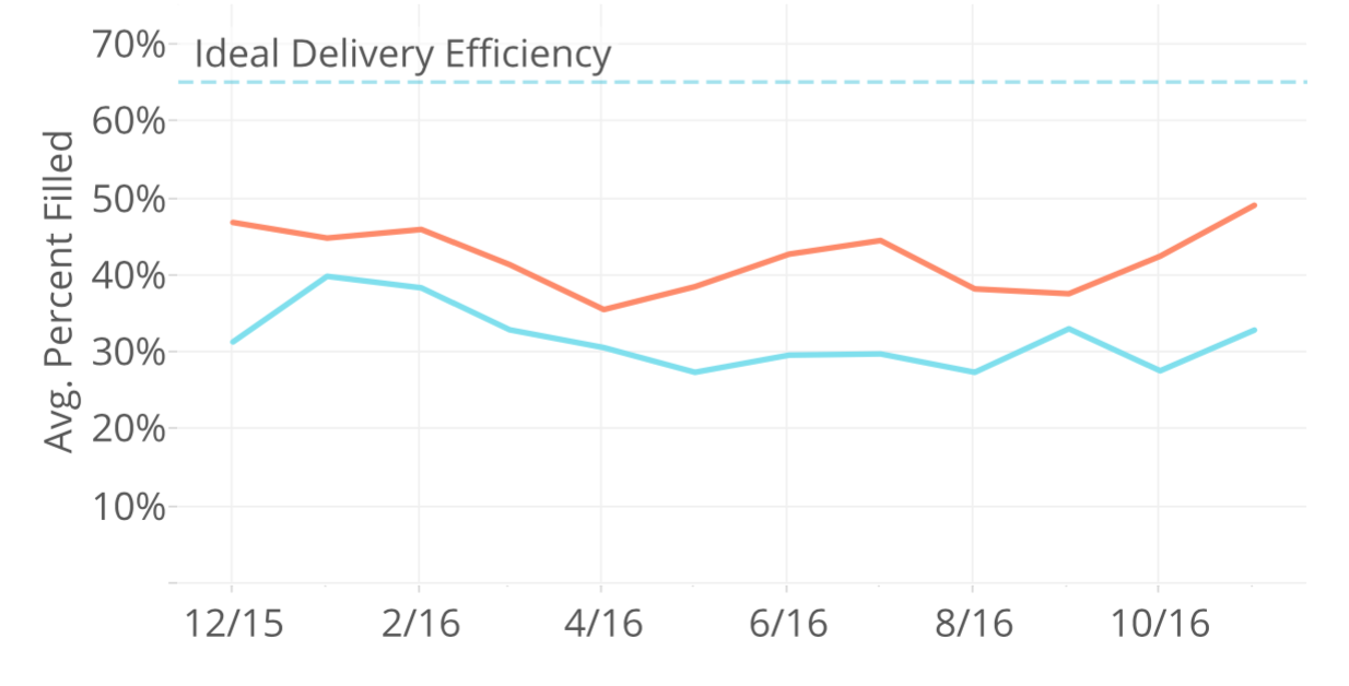
This article is part of our series on fuel delivery efficiency. Tank Utility offers every customer our detailed Delivery Efficiency Analysis Report using their delivery history data. The report helps fuel suppliers to benchmark their performance and find ways to improve efficiency and reduce costs.
Fuel Delivery Efficiency Series:
- Fuel Delivery Efficiency Analysis Overview
- Average Drop Size – Actual vs. Ideal
- Avoidable Delivery Costs
- Accounts Where Heating Degree Days Don’t Work
- Run-Out Review
- Red-Flag Accounts
- New Customer Check-Up
Average Drop Size – Actual vs. Ideal
The chart below shows one way to look at delivery efficiency, with average drop size month by month over a year. Fill (or drop) size is converted to a % of tank size from gallons so that deliveries to different tank sizes can all be combined and compared. In the chart below, a 200 gallon fill on a 500 gallon tank (200/500 = 40% of tank size) would be the same as 40 gallons in a 420# (40/100 = 40% fill). No matter the actual drop size, the bigger the % of fill, the more efficient the delivery. This chart below shows the average fill size for all deliveries to all tanks (of all sizes) in a given month.

You’ll notice that the chart above has two lines. The orange line is the average fill size for will-call customers. The blue line is the average fill for auto (or forecast/K-factor) customers. The will-call drops in this example averaged 43% over this time frame, while the auto drops averaged only 33%. Other potential ways to look at drop size include:
- company- vs. customer-owned
- residential vs. commercial
- will-call vs. auto (as shown here) vs. fixed (weekly, monthly, etc.)
Slicing delivery data in multiple ways may help quickly identify segments with potential for improvement.
As expected, there are peaks a valleys in the efficiency over the year. In general, fill size is highest in the winter months and lower in the summer in this example. The dashed line at 65% represents an ideal or target efficiency for many fuel suppliers. Some months, getting to that level is just a little stretch, other months it would be more of a challenge.
Looking at the history of your drop sizes over a a few months or a year will help you set a baseline and see where to start making improvements.